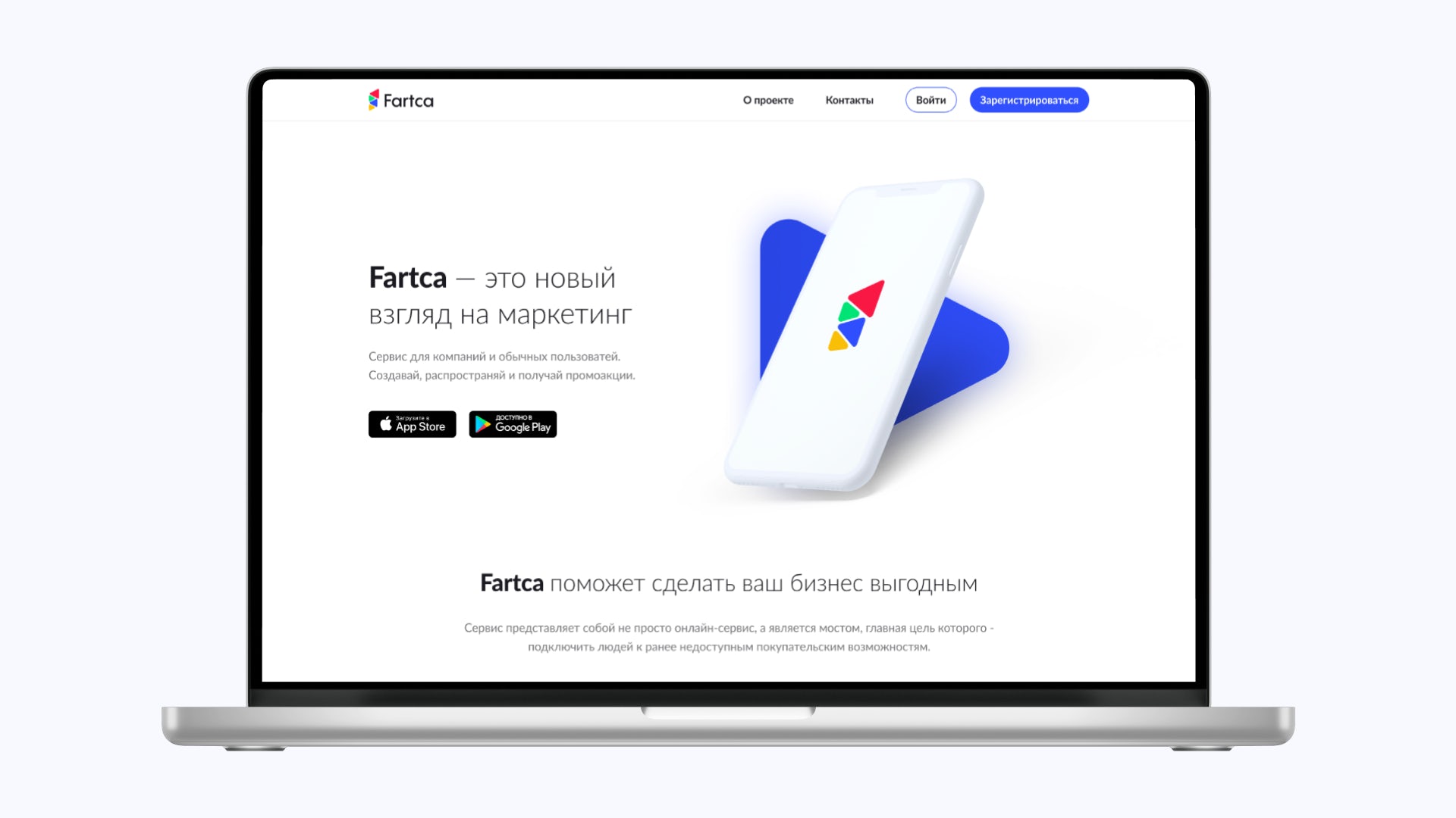
Fartca
Challenge
Embarking on the Fartca project brought forth the exciting yet complex task of creating a platform that seamlessly connected businesses with users through promotions.
The challenge lay in understanding and navigating the intricacies of promotion creation, distribution, and user engagement while maintaining simplicity and functionality.

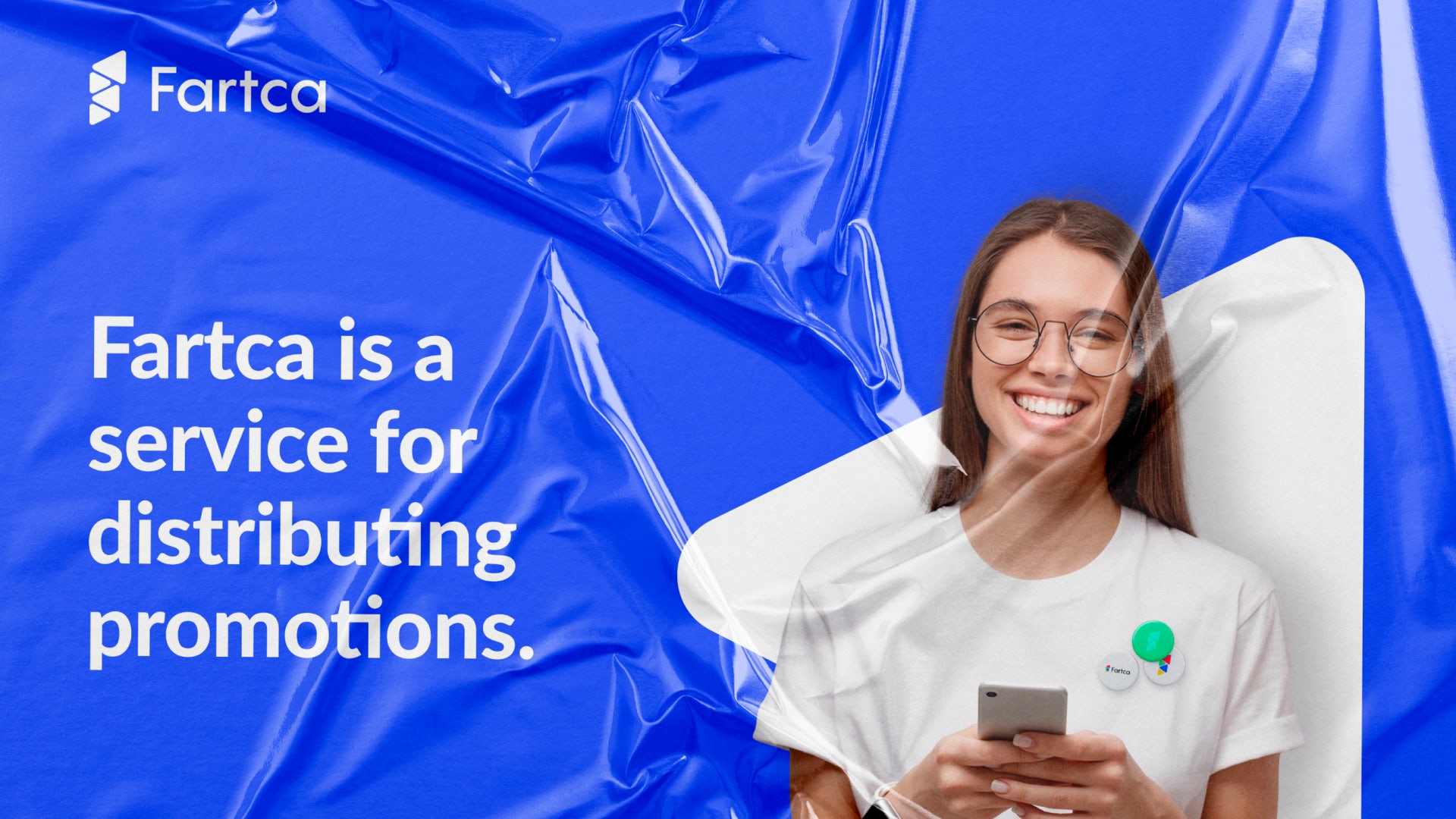
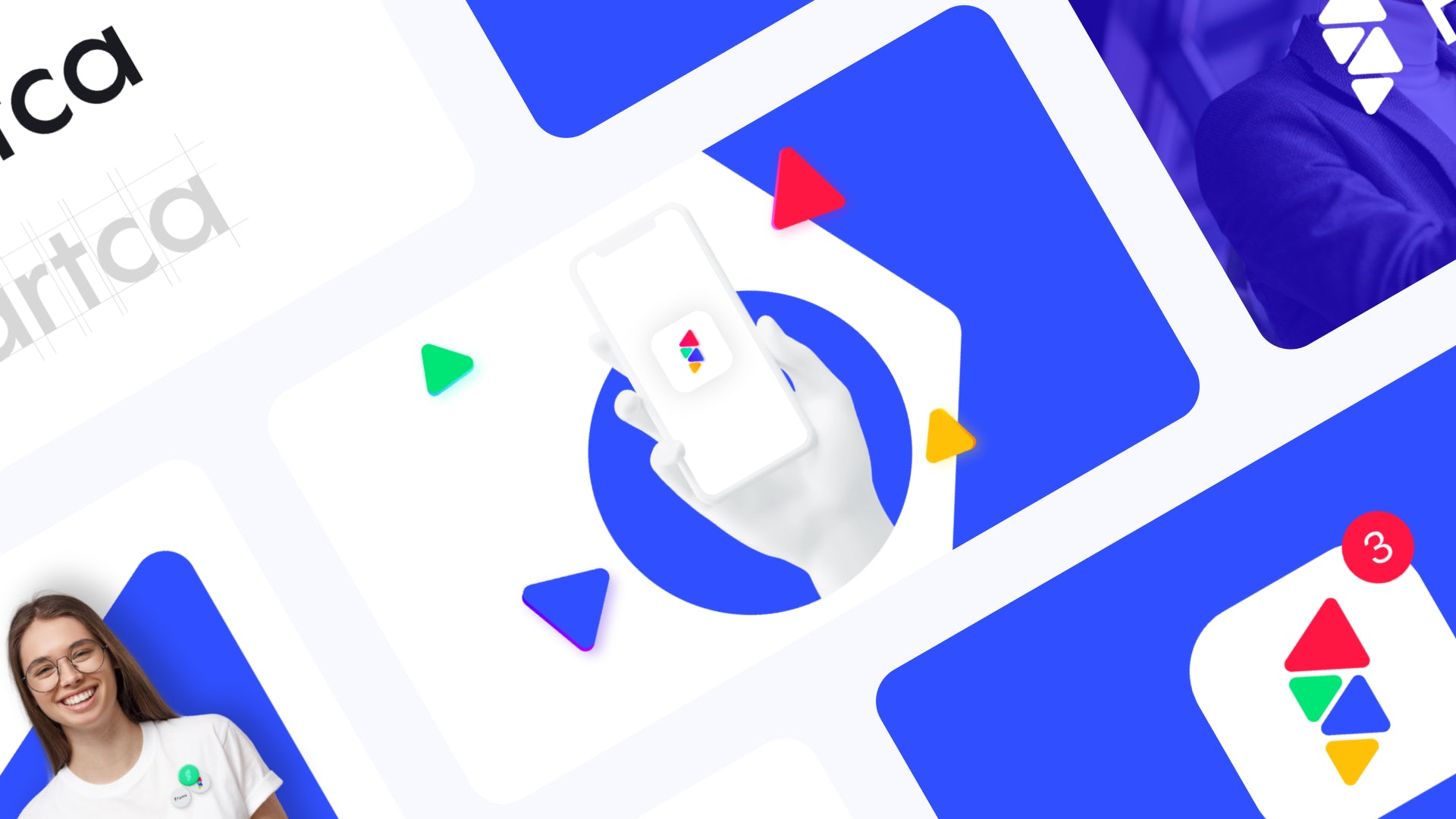
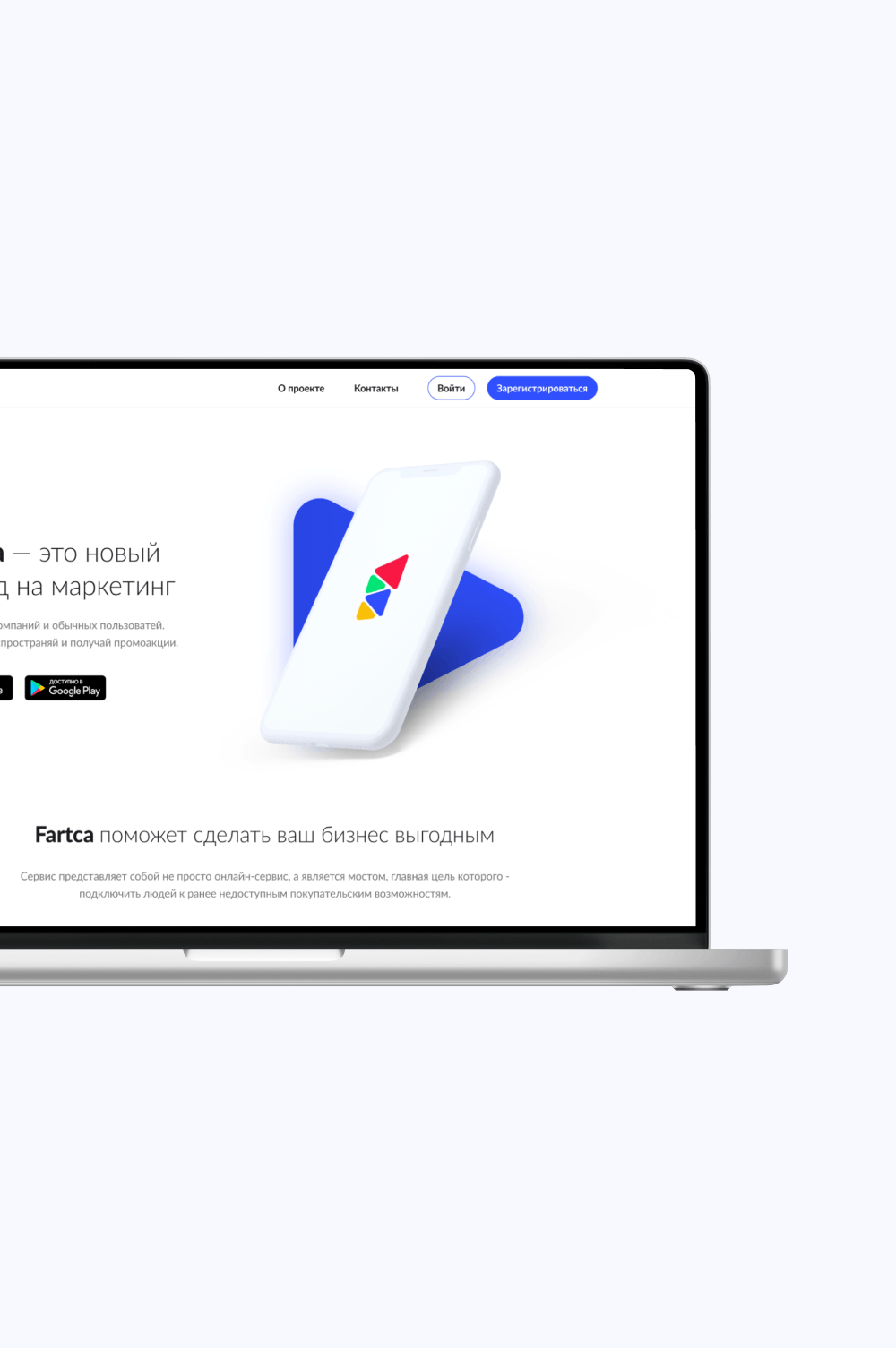
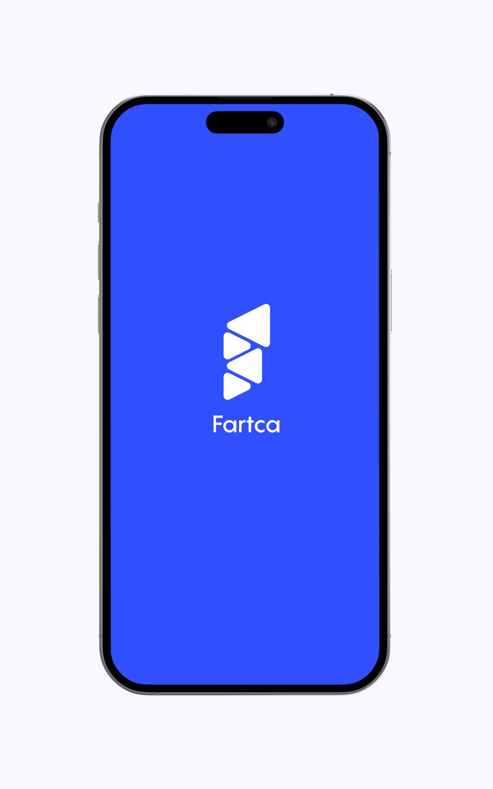
Fartca is not just an online service, but a bridge, the main purpose of which is to connect people to previously inaccessible shopping opportunities.
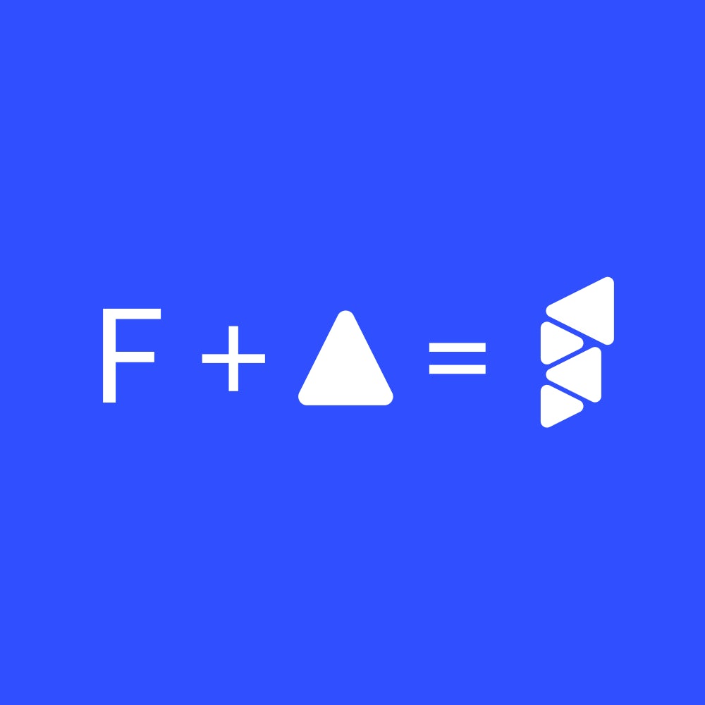
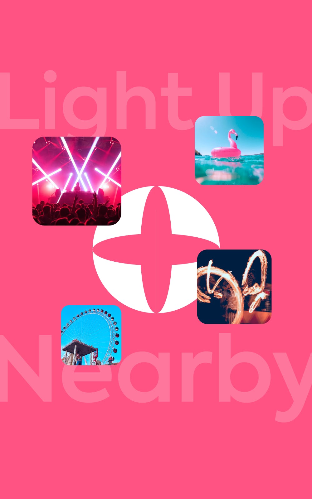
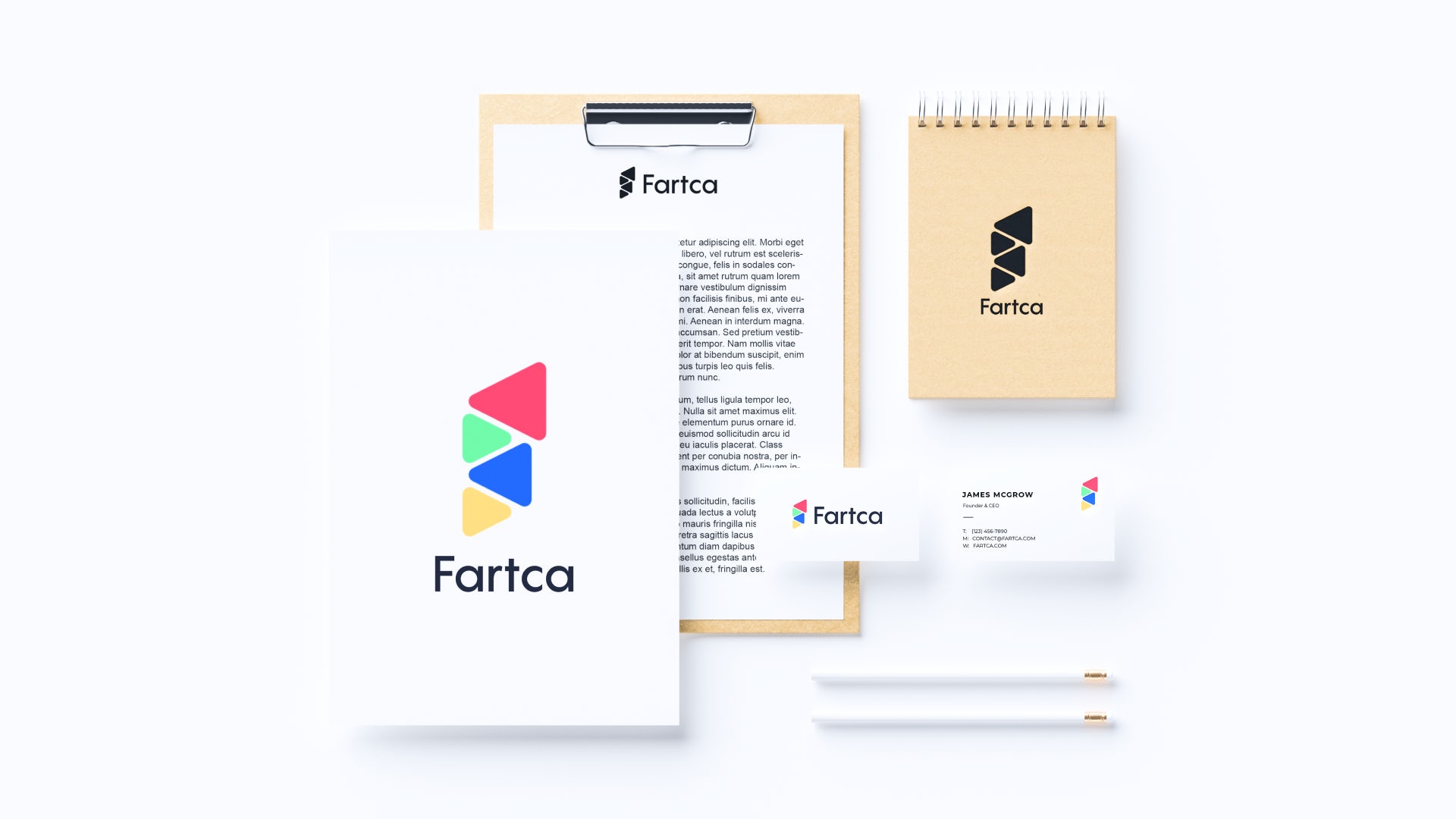
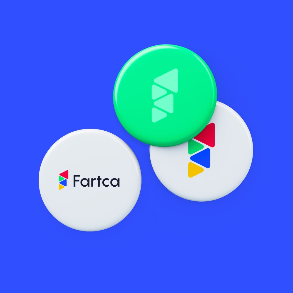
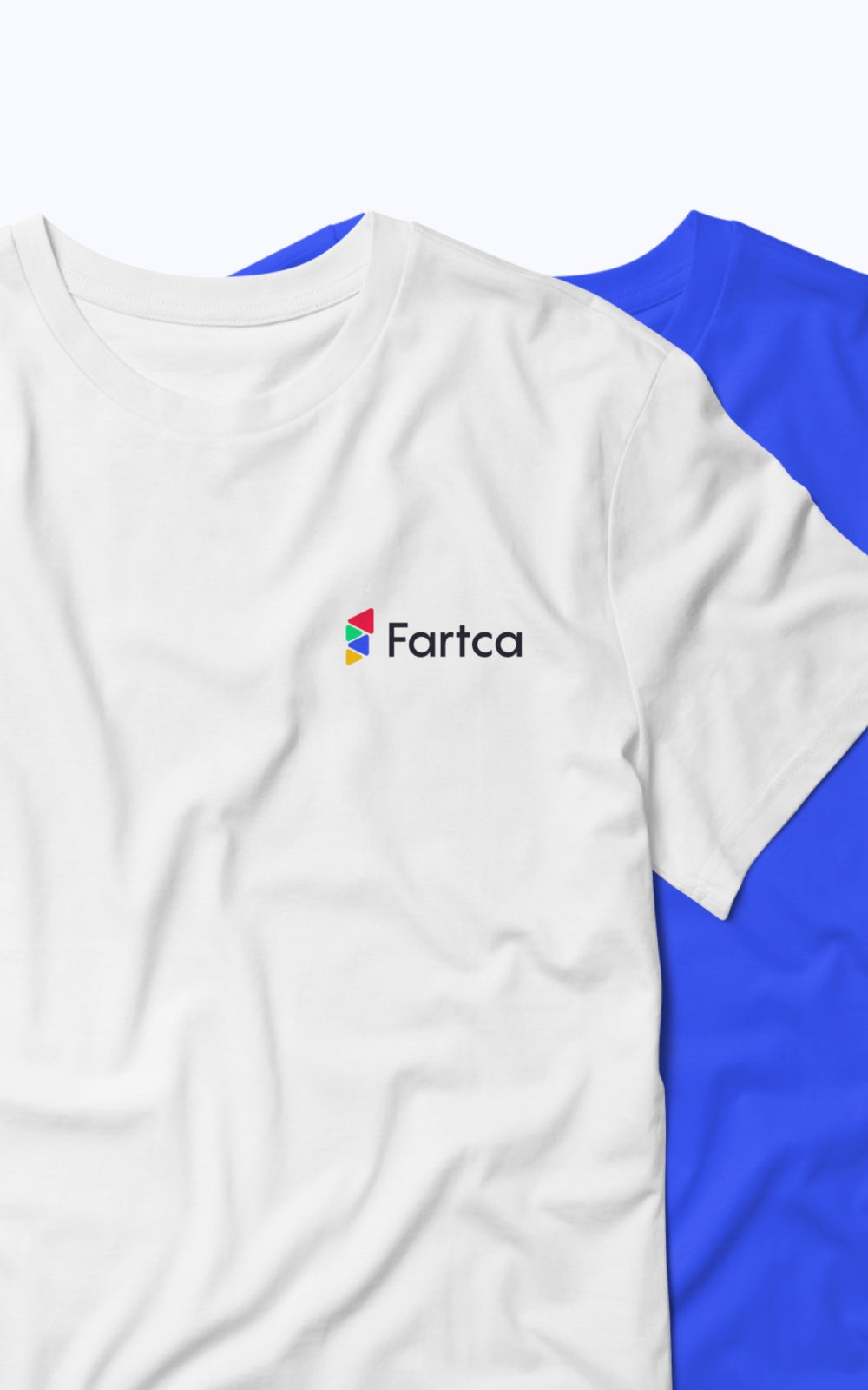
Crystal triangles symbolize possible areas in which there may be a promotion, for example: clothing, entertainment, technology and e.t.c.


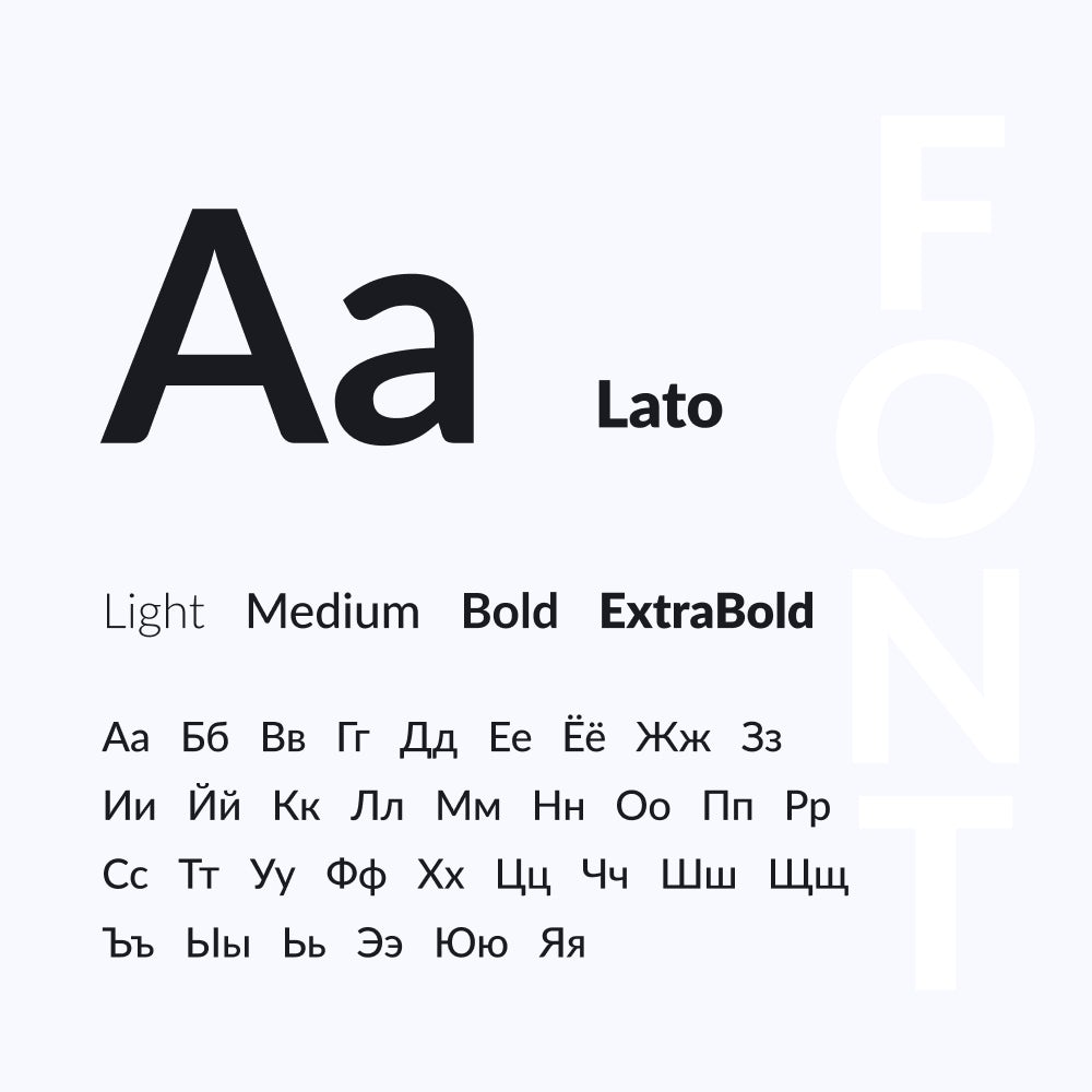
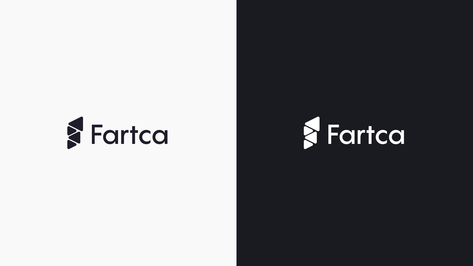
The Lato typeface lends precision and succinctness
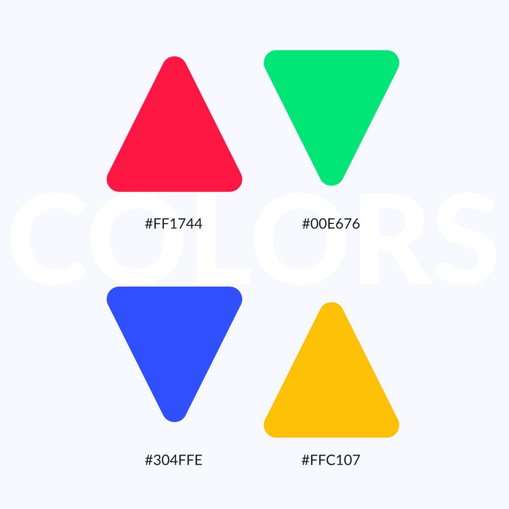
Vibrant hues chosen using Material Design Palette
Approach
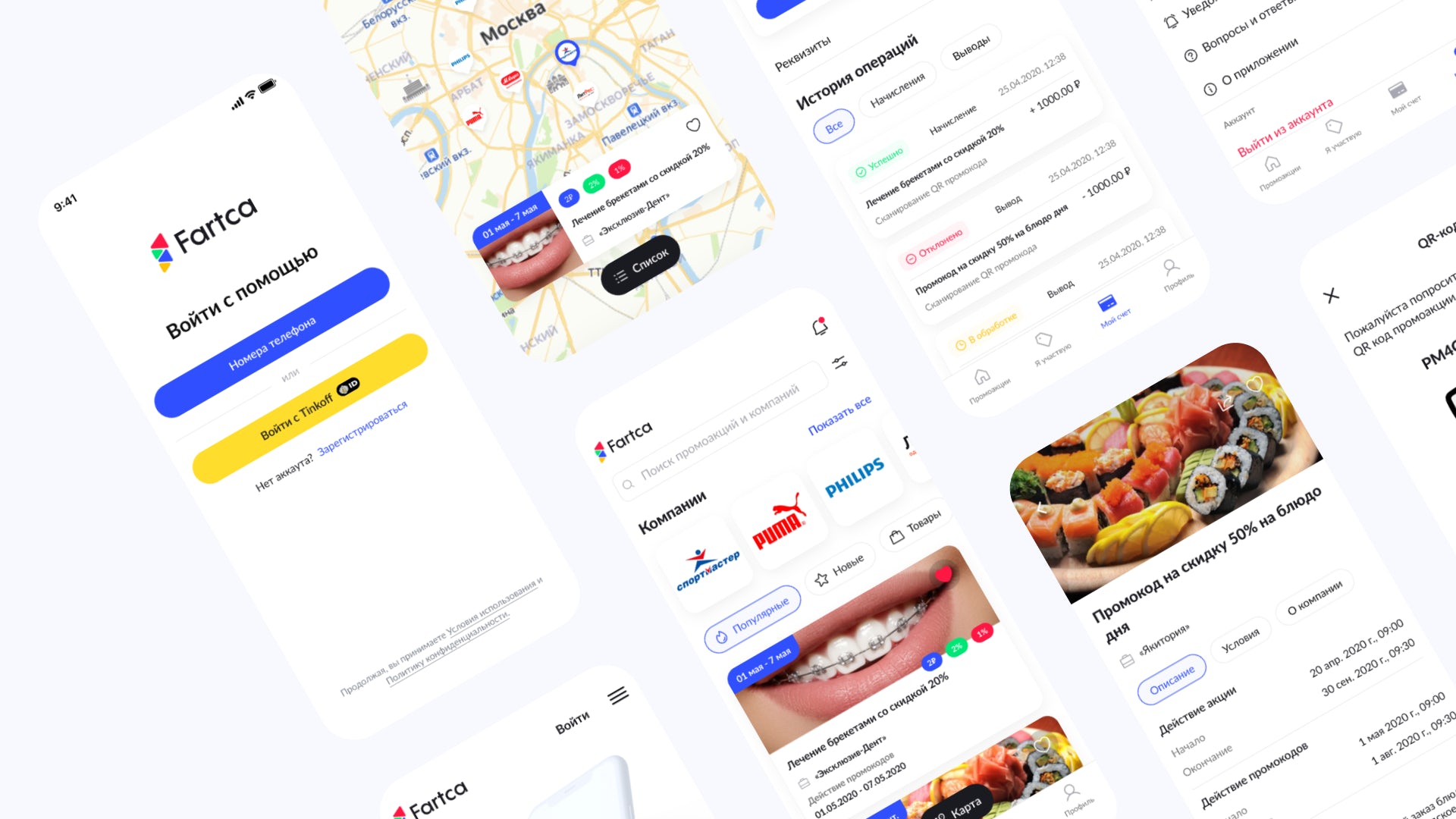
My approach involved a deep dive into the promotional landscape and user behavior. Through immersive research and сonstant communication with the client, I shaped the project's core features, ensuring they resonated with the needs of businesses and potential promoters.
Visuals and Design Principles
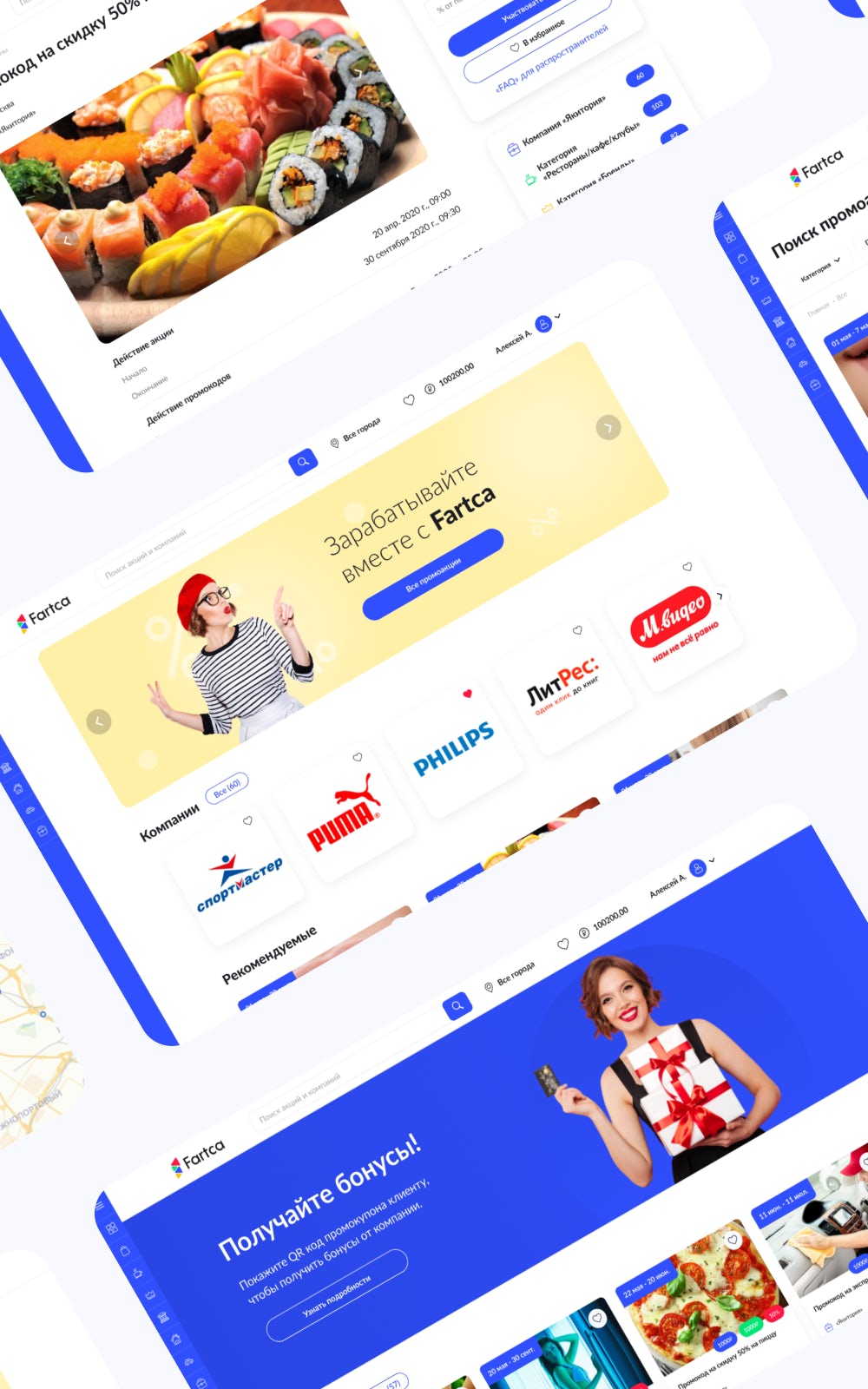
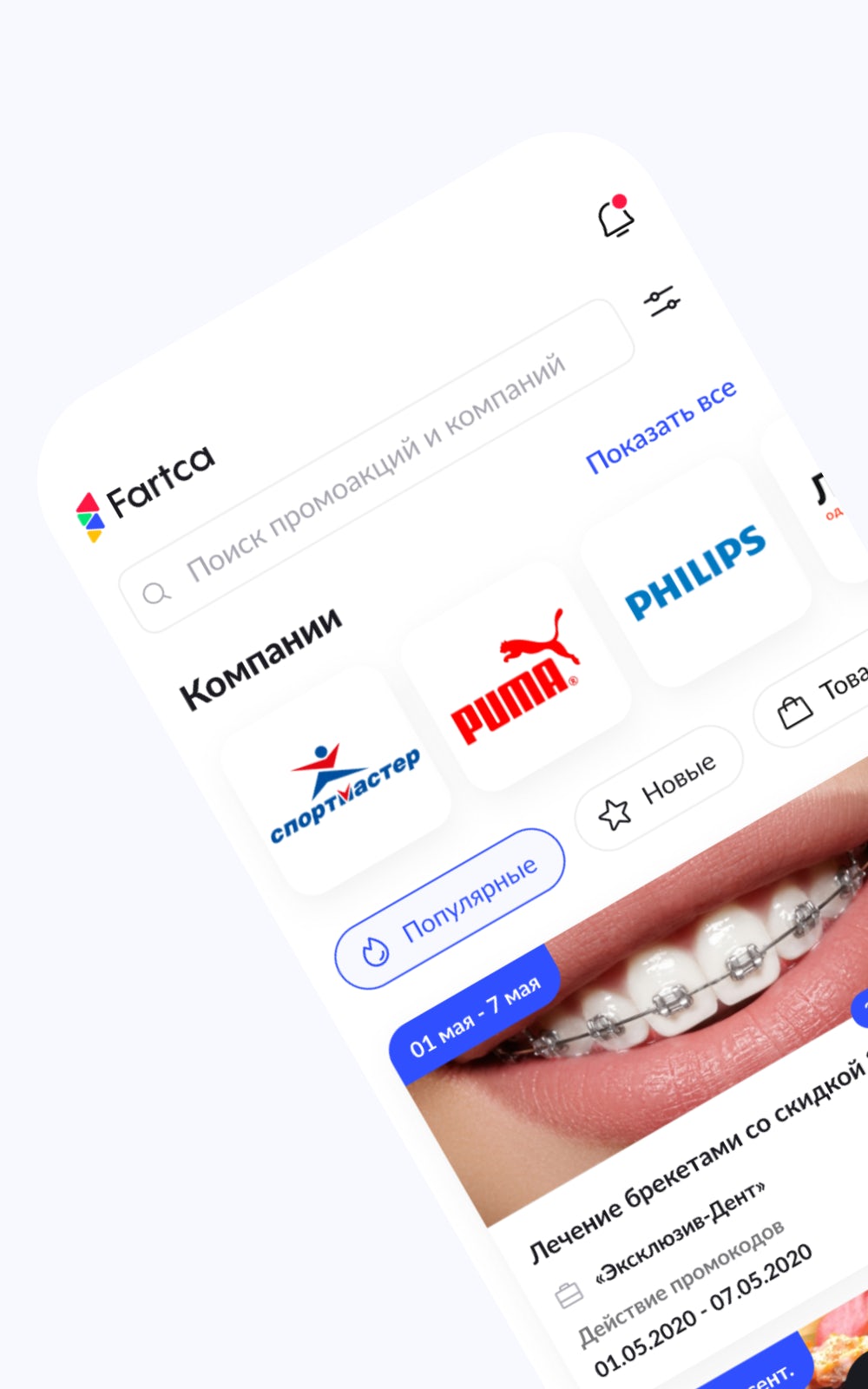
Wireframes and design drafts helped materialize the user journey, ensuring a seamless experience. The integration of crystal triangles and a thoughtful color palette created a visually cohesive brand identity.
Results
The result was a holistic platform that empowered businesses to create promotions and users to become distributors. The applications and web service acted as a central hub for promotion creation, distribution, and user engagement and a rewarding system for promoters.
This design and functionality fostered a symbiotic relationship between businesses and users, achieving the project's overarching goal.